Friday, October 24, 2008

a mystery wrapped in ... red

This piece was designed around a fused glass bas relief of an image that keeps begging me to reinterpret it in multiple forms (as is evident from many past posts) :


At first, I was going to stitch her form on white cotton and merely place that under the piece, praying that the image would stir one's soul. Not so. A test run was less than inspiring.


Time for Plan B. Next, I produced this panel in Photoshop, using my original Nude Stitches image:

I established my palette with the left and right images. I hoped the more detailed black and white version would show through the red glass, so I used as much contrast as possible. I printed this on a strip of 20" wide cotton.

For the 'frame," I chose a solid Chinese red and several pieces of turquoise, one of which I had hand dyed some time ago. I altered all fabrics by applying fusible web,which I had painted in various color combinations. Here is one of those pieces of fusible web:


With freeform curved piecing , I made the frame. Here is the piece before quilting:


And here are the three ladies up close and personal:


Now, the test -- will the black and white image show through the red glass, rock my world? You'll soon see!

For texture, I wanted close vertical stitching, echoing the undulating lines of the form. To heighten the effects of the shape of the form, I quilted the lines of the major body parts of each of the three incarnations -- the center one thrice.

Here is the quilted piece, sans binding or glass. Some of the different painted fusible effects are visible here. (The suspense mounts...will the figure emerge from underneath the mysterious glass???)


I bound the piece and got the plexiglass ready, drilling holes with my trusty Dremel tool:


I like to make the backs interesting, so I used a beautiful African fabric:


I printed the label on organza:


What? You don't care to see my stinking label, you wanna see how the glass turned out?

Well, first I had to locate her placement with needles coming up from the back:


Then, I placed the glass over the needles and took my first look at how the image and the glass communicated. Ta da!


I think I love it!!! Even though no light passes through the piece, the image below the glass is quite visible, and the bas relief looks like...bas relief!!! Phew!!! (That's a lot of !!!!!!!s)

Here it is, placed on the kitchen table (which is pale green, as seen through the plexiglass border):


Here it is on a hallway wall, not a great shot, but at least it gives a feel for what it is like when hung:


We hang the Buenaventura Art Association show on Monday (opening reception is Nov. 7) and she will be for sale there. Sniff sniff. I think I will have to have visitation rights if someone buys her.

Thursday, October 16, 2008

elation, si; rejection, no

Elation number one: today's sunrise, out my front door -- Pt. Mugu and the spectacular Pacific, top; the foothills, bottom:


Next, the rejection: my piece Cellular Structures: Microworlds was rejected by the Studio Art Quilt Associates "Points of View" juror.


Sniff, sniff. Now, here come the palliatives -- the rejection has enhanced my character, this closed door brings another...open door...but wait! The sunrise this morning, out my door, of course!

And the 'lemonade from lemons' one -- well, now I get to put the piece in my upcoming Buenaventura Art Association show. Okay, I have stopped licking my lemon-laden wounds.

But back to the elation! I successfully fired two new pieces in my kiln (read: no cracks or devitrification [cloudy stuff on the glass])! One is a bas-relief-y attempt to render my 'nude stitches' image in glass:


I had made a clear glass version of this for a piece I donated to the SAQA Auction.

I really like it in red, and will incorporate it into yet another piece based on this image, which I will print on either silk or cotton:


The second fused glass piece is based on my fave alstromeria creation:


A multicolored glass was used, again with an attempt at a bas relief representation, focusing on the tiger-like markings and the structure of the petals and leaves.

Here it is, straight out of the kiln:

The front does not "read" clearly, and since mounting these pieces in textile works prevents the use of light to illuminate the glass, I looked at the reverse side to see if that might work. Here are both sides, with a little help from the sun (top, the original image representation; bottom, reverse side representation):


I think the reverse side will work - the bas relief effect is visible sans light, as are the varied colors of the glass.

I will have to drill holes in these so the glass can be attached to fiber. There is always the risk of breakage --wish me luck!

Inspiration in the face of rejection. A "good thing," as Martha (Stewart) would say...

A mock-up of the pieces and their forbears:


Sunday, October 12, 2008

a stripe of a different time

Some time ago, I re-smelled my first grade textbook, Fun with Dick and Jane. Immediately, my teacher Miss Feeney was before me, cajoling us to sound out Dick and Jane's pet dog's name: S-p-o-t. The evocative nature of memory-through-smell is well known.

As I was working on a piece that had been planned in my brain for a while, my memory switch was once again activated, but this time by a pattern!

Those of use who were lucky enough to experience the utter revolution in sound that was "I Wanna Hold Your Hand" as well as "Purple Haze" may also have been mesmerized by the Treasures of Tutankhamun exhibition in the 1970s. The iconic mask of King Tut's mummy was striking with its gold and navy stripes:

[Image from National Geographic (http://www.nationalgeographic.com/tut/)]

It is this image that reappeared to me as I worked through my design. Here's how it happened.

I wanted to design something with one of my fused glass pieces, combining it with fiber. I had embossed an image on copper and fused that to glass. Here she is:


To pick up the copper color, I decided to mount the fused glass on some wildly pleated copper fabric. I wrapped the fabric around a base of Lutradur.


I auditioned the two together:


So far, so good. At Road to California in January I had purchased some wrinkly painted fabric that would be the perfect background -- again, my favorite blue/copper combo. The textures worked beautifully with those in the the copper fabric piece.


Here is where King Tut comes in. I decided to quilt the fabric and paint around the quilting. To complement the curves in the woman's form, I wanted straight lines, hard angles:


These would be vertical, on each side of the piece. I wanted to mount this all on a gallery wrapped canvas. I thought I would paint inside alternate stitching lines.

I used a high quality sable brush for best control.


My initial plan was to paint in between every other space -- but that looked weak and insubstantial. The boldness of the copper form called for a stronger border. I then painted inside all the block designs, not just every other one.


I auditioned this with the centerpiece -- and here is where King Tut appeared in my mind! Those strong horizontal stripes, framing an inner human form.


Yes, King Tut indeed! At least that's how my brain works!


Maybe seeing Steve Martin's King Tut act might excite the stripes memories in you:

http://www.youtube.com/watch?v=pP7AJiQM2RI

Anyway, I then stapled the fabric to the canvas wrapped stretcher bars. The frame is one inch deep:


Gallery-wrapped corners:

Front view:


I used fishing line to attach my copper crinkly fabric rectangle, and attached my fused glass piece, drawing the fishing line all the way to the back, anchoring all attachments with square knots. I will later add a strong glue to each knot, as well as hanging wire.

Here it is, Copper Form:

Friday, October 10, 2008

from whence we came...


Tijuana, 1950s: Daddy, Mom, and their good friend Auntie Rosalind


My mother designed all her clothes. Both she and they were stunning.

Her brilliant seamstress lived 16 miles to the south, in Tijuana. Trips there were always an adventure -- Avenida Revolucion and all its pinata-laden decadence - including the striped donkeys, poised for more photos like the one above.

However, that Tijuana adventure turned sour when my older sister and I had to have fittings with Celestina for our Easter dresses.

Little Lanz prints were all the rage, and the dresses were expensive. But we could grace the pews of Christ Episcopal Church in Mother's Little Knock-Offs, our own precious faux Lanzes. Mom designed them; Celestina made them.

Even then, my aesthetic rejected this busy fabric with its make-your-eyes-go-bleary perfect but way-too-busy symmetry.

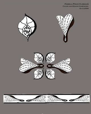
You can appreciate my shuddering deja-vu when I looked at the horror I created in my latest homework assignment for my Color and Design class. The story ...

Assignment: create designs from natural objects, use those elements to form a pattern, produce it in black and white and specified color combos.

I dutifully chose my natural objects, pictured in a previous post -- garden variety alstromerias:


...and here are my dutifully-drawn abstractions (the "elements" of the pattern-to-be):


So far, so good (no gagging). Here is my black and white pattern (throat starting to close now):


Oh, this feels too close! Those Lanzesque dresses, those overwraught patterns -- it's all coming back to me!

Now I had to color the pattern. Here are my results:


Jockettes, aging or not, do not cotton to this frilly tomfoolery. I will turn in this assignment, but I may not pick it up when it is handed back.

Here is a reward for having had to look at these designs: Sanjagirl at nine months!!! Doesn't she look like the RCA Victor (Victrola) dog?


Here's to the aesthetics of 'spare' design.
Related Posts Plugin for WordPress, Blogger...